Creating visually appealing and cohesive home decor can be both exciting and daunting. A colour chart is one of the most effective tools to help you achieve a harmonious interior design. It can assist you in choosing complementary colours, understanding the psychological impact of certain hues, and integrating them into your home to enhance the overall aesthetic aand atmosphere. Here’s how to use a chart effectively to elevate your home decor.
Colour Theory
Before exploring the practical applications of a colour chart, it’s essential to understand some basic colour theory. This theory explains how they interact with each other and the effects they have on mood and perception. The main ones are red, blue, and yellow. These can be combined to create secondary colours (green, orange, and purple) and further mixed to produce an array of tertiary ones.
It typically displays these relationships in a wheel format, helping you see how colours relate. Complementary ones (those directly opposite each other on the wheel) can create a vibrant look if used in balanced proportions. Analogous colours (those next to each other on the wheel) provide a more harmonious and serene look.
Choosing a Palette
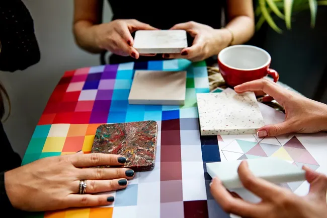
Selecting a palette is the first step in transforming your home decor. Here’s how to use a chart to pick the perfect palette:
● Identify the Primary Hues: Start with a hue that you love or one that dominates the room, such as a large piece of furniture or artwork. This will act as your anchor or base one.
● Find Complementary Colours: Use the hues chart to find complementary ones for your primary hues. These, when used in accents, can make your primary one stand out more and add visual interest to your space.
● Consider Neutral Shades: Neutrals like beige, grey, and white are versatile and can help balance your scheme. They provide a backdrop that lets your chosen ones shine without overwhelming the space.
Applying Colours to Your Space
Once you have your palette, the next step is to apply these hues to your space effectively:
● Wall Colours: Choose a dominant one for your walls that complements the most significant furniture pieces in the room. Lighter shades can help make the room feel bigger and brighter, while darker hues can create a cosy, intimate atmosphere.
● Accent Colours: Use your secondary and tertiary ones for accents such as throw pillows, vases, curtains, and artwork. These should support your primary one but also add their own character to the room.
● Textures and Materials: Colours can look drastically different depending on the material and texture. A glossy finish can make them look more vibrant, while a matte finish might soften them. Experiment with other materials to see how they affect the perception of your chosen ones.
Tips for Experimenting
● Use Swatches: Before committing to paint, get swatches or sample pots and observe how they look at different times of the day and under different lighting conditions.
● Mix Textures: Combining various textures can add depth and interest to your scheme. For instance, incorporating a velvet throw in a deep jewel tone can lend a luxurious touch to any room.
By effectively utilising a colour chart, you can design home decor that is not only visually appealing but also exudes a welcoming and comfortable atmosphere. The key is to experiment and have fun with hues, using the theory as a guide but not a strict rulebook.